914-OUTLINE.ttf
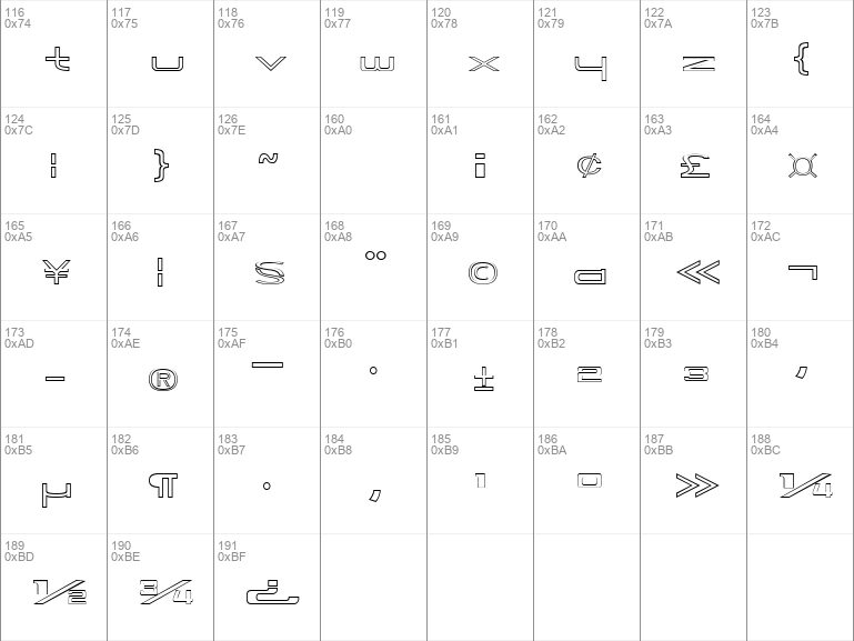
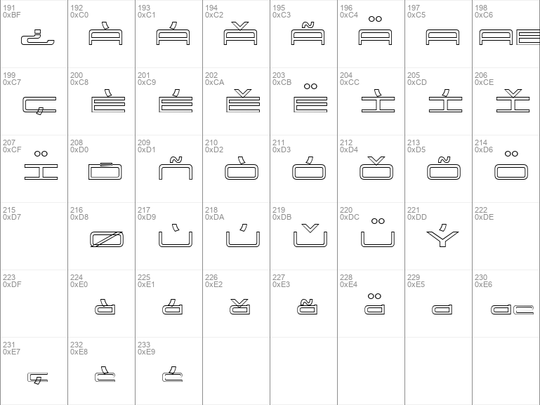
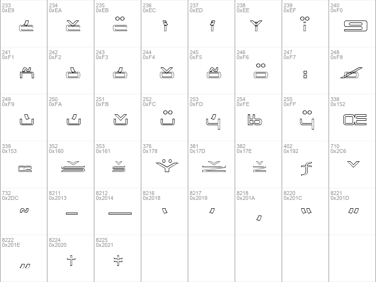
914-OUTLINE.ttf Image

914-OUTLINE.ttf info


914-OUTLINE Regular | 914-OUTLINE.ttf
- Font family: 914-OUTLINE
- Font subfamily identification: Regular
- Unique identifier: E. V. NoratII: 914-OUTLINE: 2009
- Full font name: 914-OUTLINE
- Version: Version 1. 000 2009 initial release
- Postscript font name: 914-OUTLINE
- Trademark notice: 914-OUTLINE is a trademark of E. V. Norat II.
- Manufacturer name: E. V. Norat II
- Designer: E. V. Norat II
- Description: FONT NAME: 914-OUTLINE
Copyright c 2009 by E. V. Norat II. All rights reserved. Permission to use this font is only granted for non-commerical; non-profit; private andor personal purposes. Commercial use of this font is prohibited.
This font is a rounded corner box shape, Sans Serif, Gothic, extended expanded and Euro style type of font. It is similiar, but not an exact duplicate, of the characters that were once used, in reference to the now discontinued 914 automovtivesports vehicle that was manufactured between 1969-1975. This font was used on various emblems, signage, placquards, brouchures, literature, promotional items, racing applications andor other applications.
Unfortunately, the original font was only made in a dozen or so upper case letters and numbers. Therefore, all of these characters are an interpretationinterpolation, such as a "best guess " or "what it should be " scenario. This font conversioninterpretation has been "cleaned up " and now has a font ratio of 1:5:11 Line width : height : width .
- License: FONT NAME: 914-OUTLINE
Copyright c 2009 by E. V. Norat II. All rights reserved. Permission to use this font is granted for non-commerical; non-profit; private, personal; andor et cetera purposes only. Commercial use of this font is prohibited.
This font is a rounded corner box shape, Sans Serif, Gothic, extended expanded and Euro style type of font. It is similiar, but not an exact duplicate, of the characters that were once used, in reference to the now discontinued 914 automovtivesports vehicle that was manufactured between 1969-1975. This font was used on various emblems, signage, placquards, brouchures, literature, promotional items, racing applications andor other applications.
Unfortunately, the original font was only made in a dozen or so upper case letters and numbers. Therefore, all of these characters are an interpretationinterpolation, such as a "best guess " or "what it should be " scenario. This font conversioninterpretation has been "cleaned up " and now has a font ratio of 1:5:11 Line width : height : width .